Soft Opening Friday 28 May 2 - 9 pm
28 May - 19 Jun 2021
wed - sat 2 pm - 6 pm
Guided Tours with the HAUNT Melodie Team
Fri 28 May at 3pm or 4 pm
Sat 5 Jun at 3pm or 4 pm
Sat 19 Jun at 3pm or 4 pm
please reserve at rsvp@frontviews.de
Frontviews at HAUNT
GROUND FLOOR
Kluckstraße 23 A / yard
D - 10785 Berlin
Please wear a mask.
IG @frontviews_berlin
FB FrontviewsBerlin
Hosted by Vincenz Sala & with the very kind support of the Berliner Senatsverwaltung für Kultur und Europa & Fonds Soziokultur.
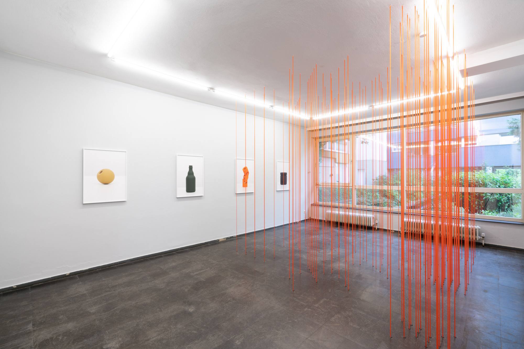
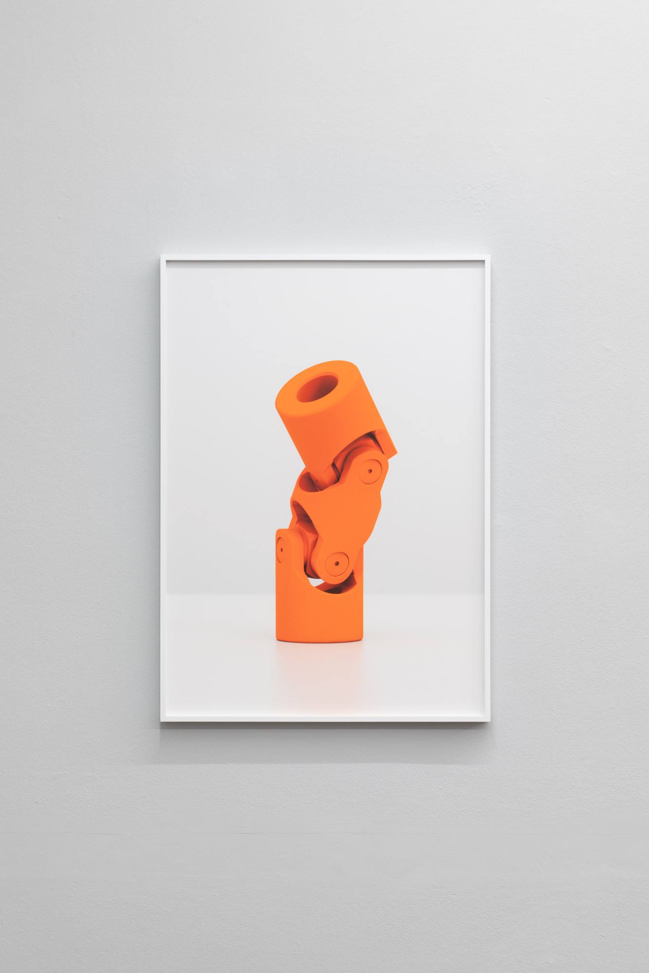
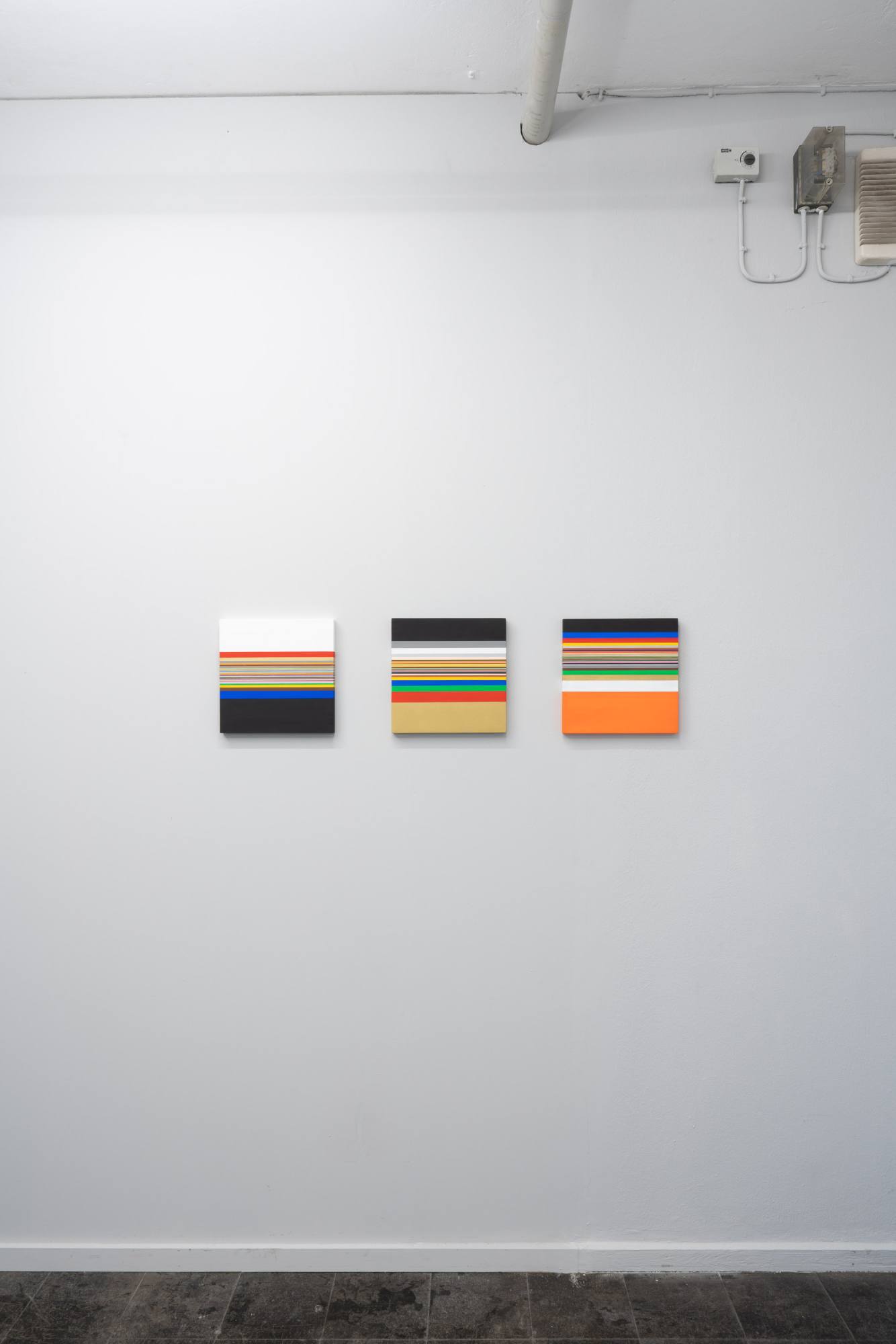
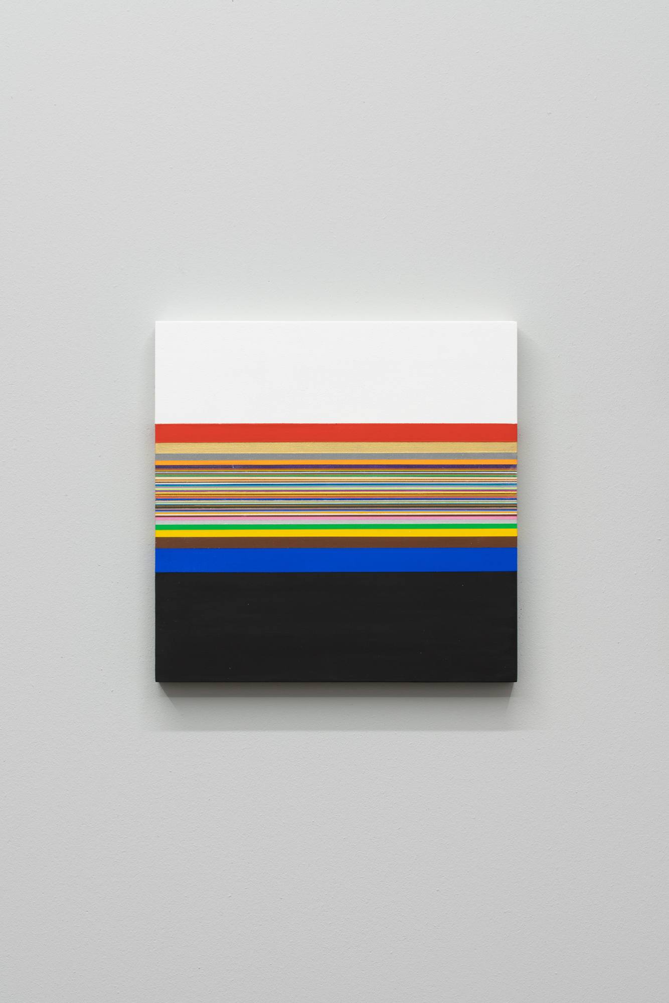
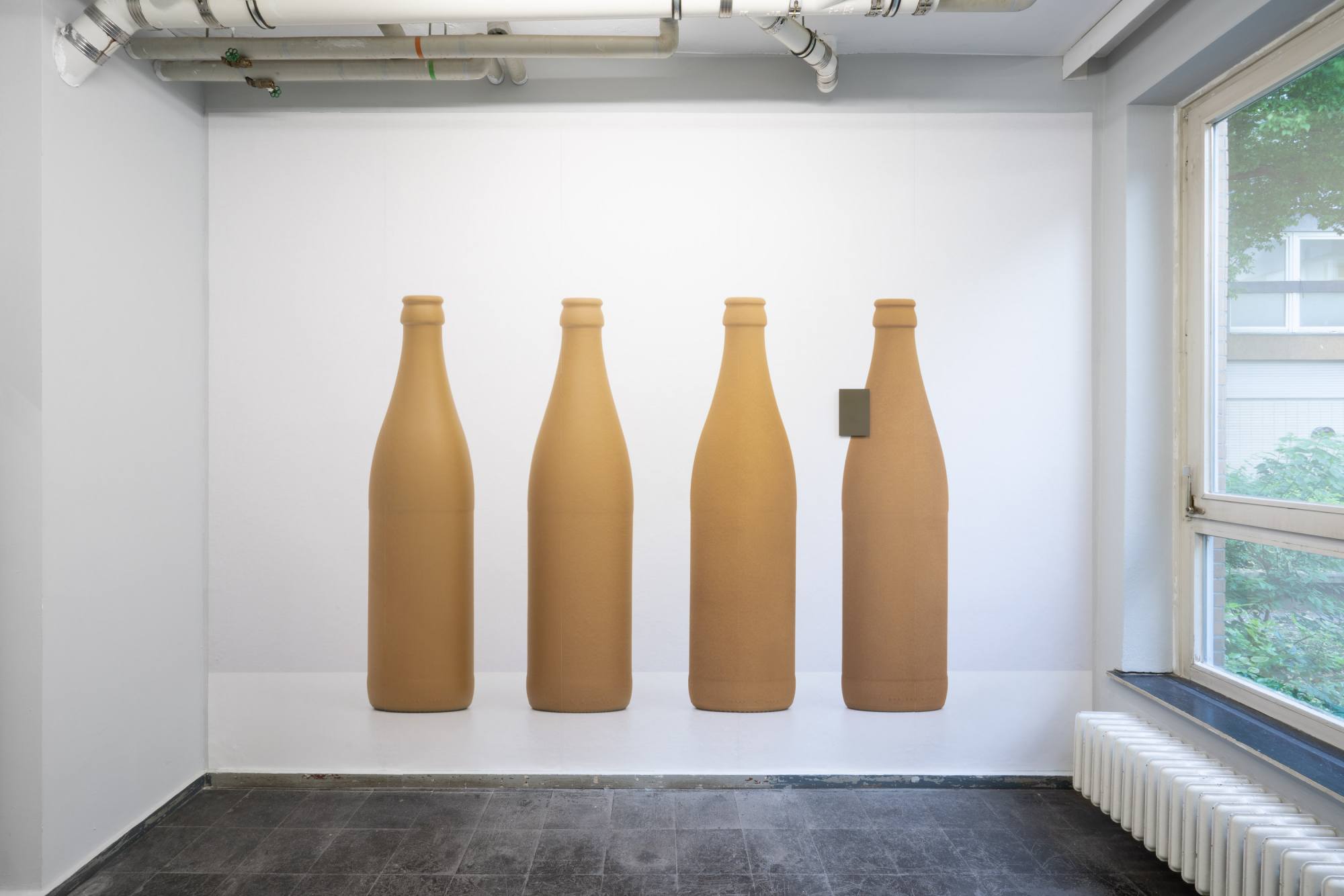
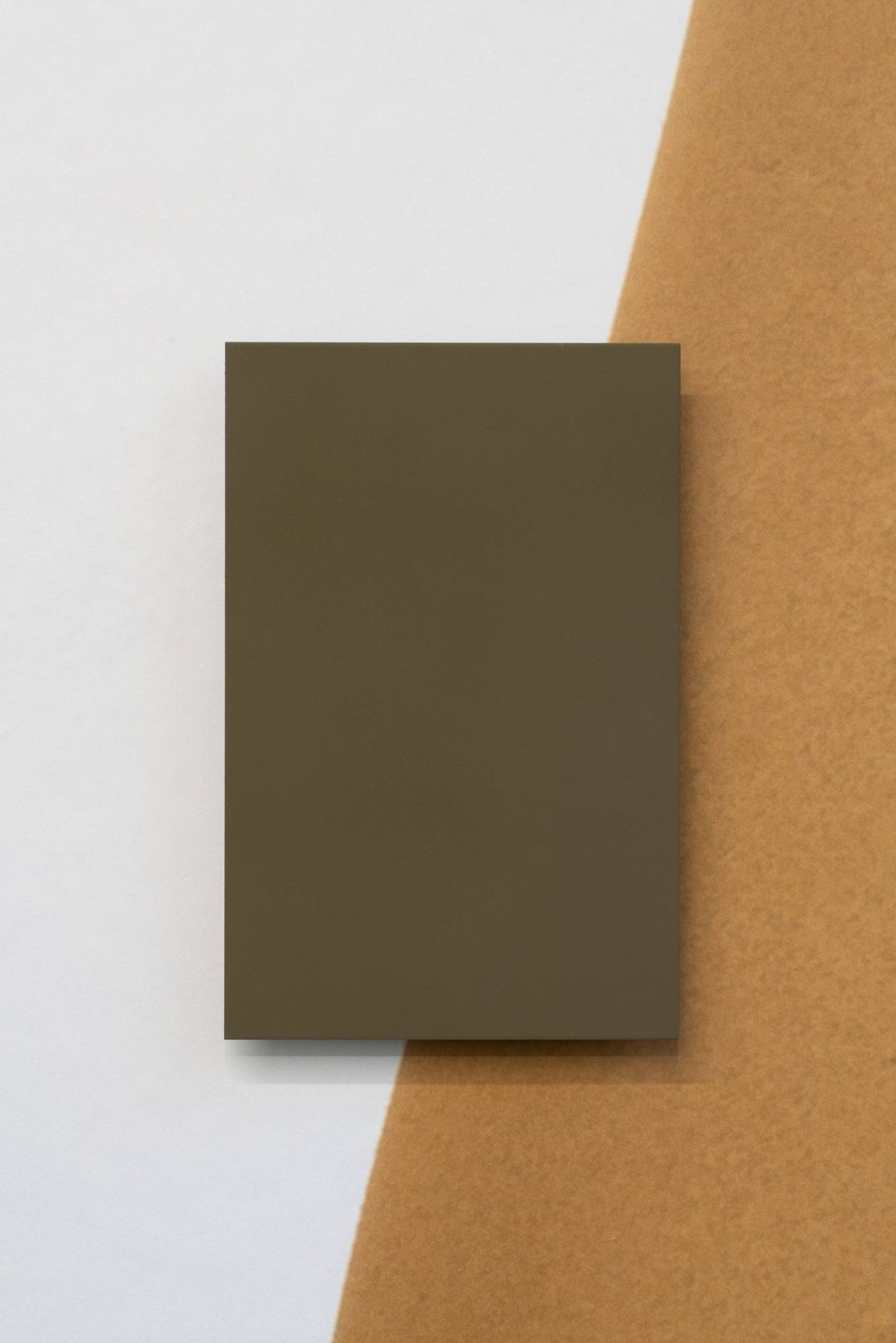
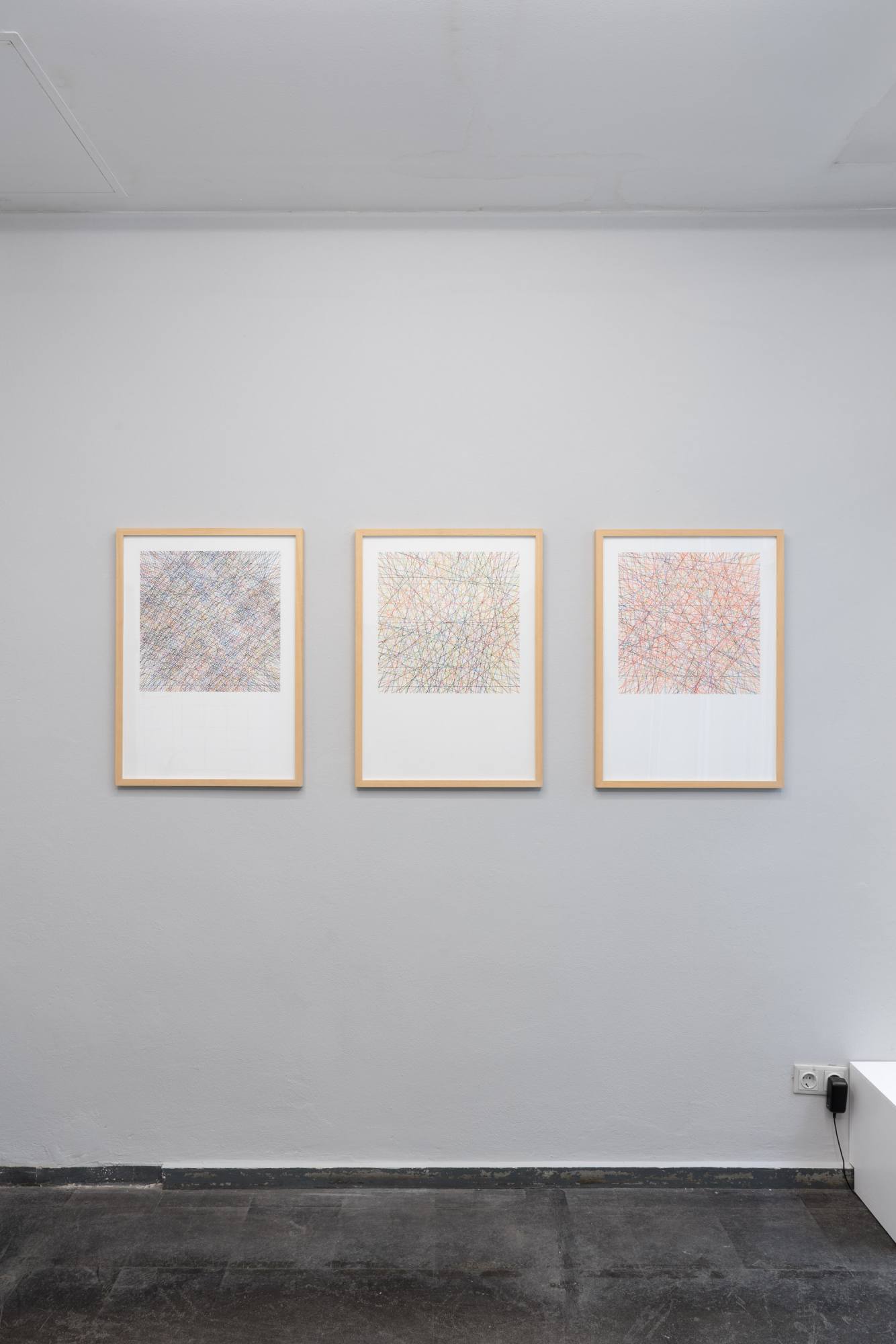
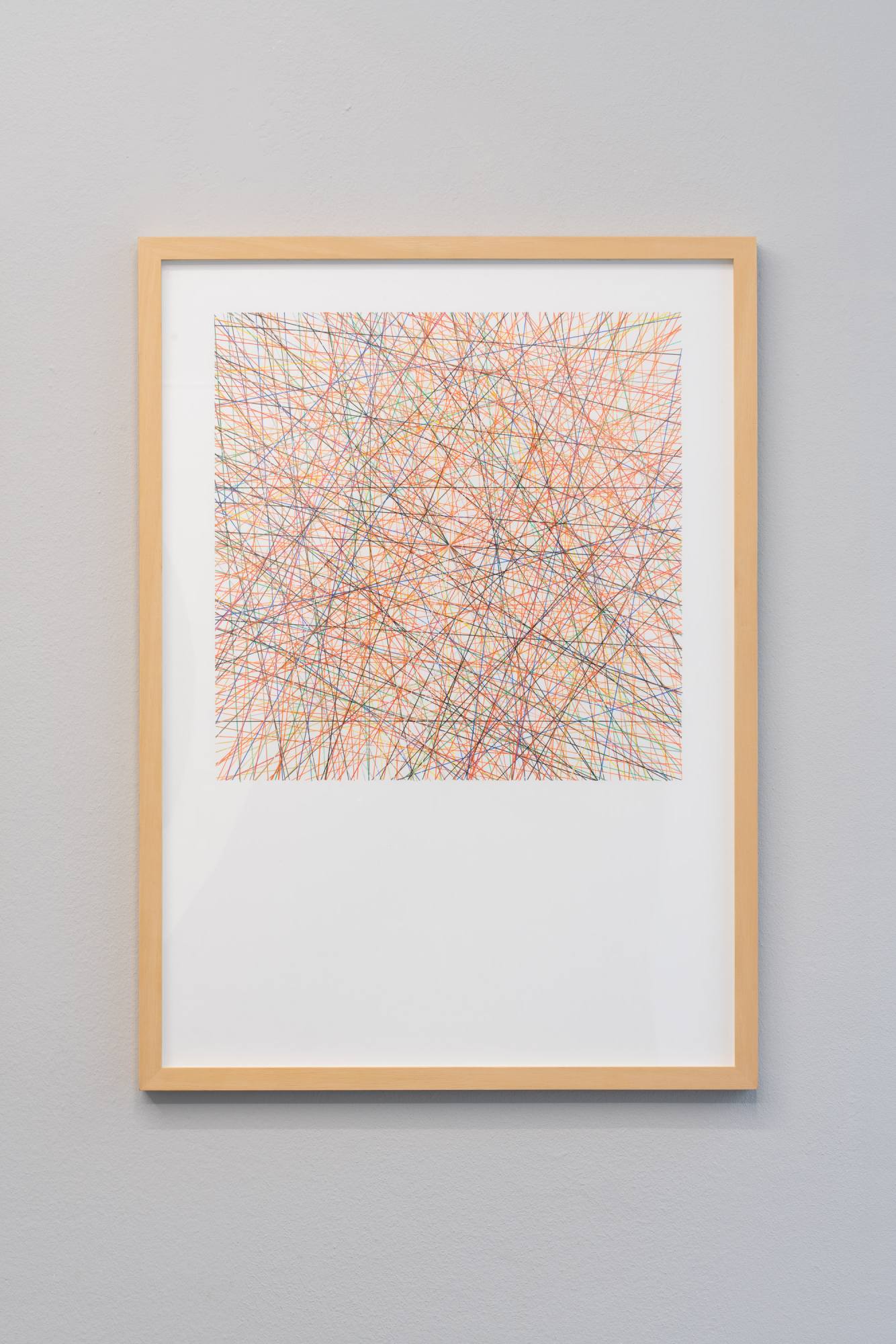
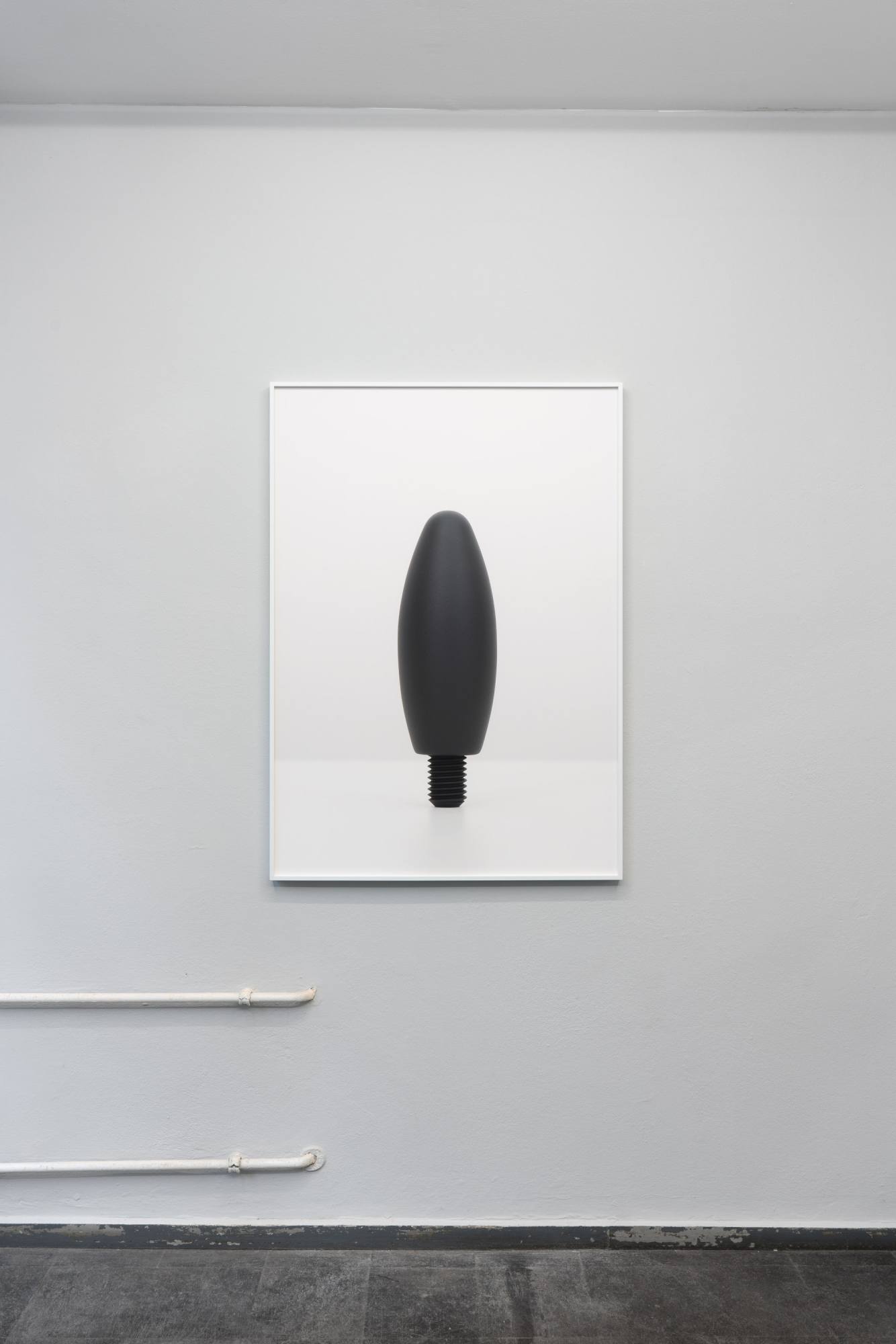


The gaze is turned westward: the colours of Los Angeles, where the exhibition will be on view in 2022, mix into the continental European climate. In the exhibition Continental Colors, Carsten Becker looks at the implications of the German colour collection RAL and the American hue Olive Drab. Willem Besselink investigates the imaginary colours mentioned in the literature of the “Golden State” California.
For Renaissance artist Giorgio Vasari, colore was nothing without disegno, the concept. Becker’s and Besselink’s colours are based on the disegno of the civilizational: regulations, norms and systems. Both artists decontextualize colour from its historic, literary and emotional purpose, in search of the logics of these contexts. In their works, they make us experience how civilizational concepts interact with us.
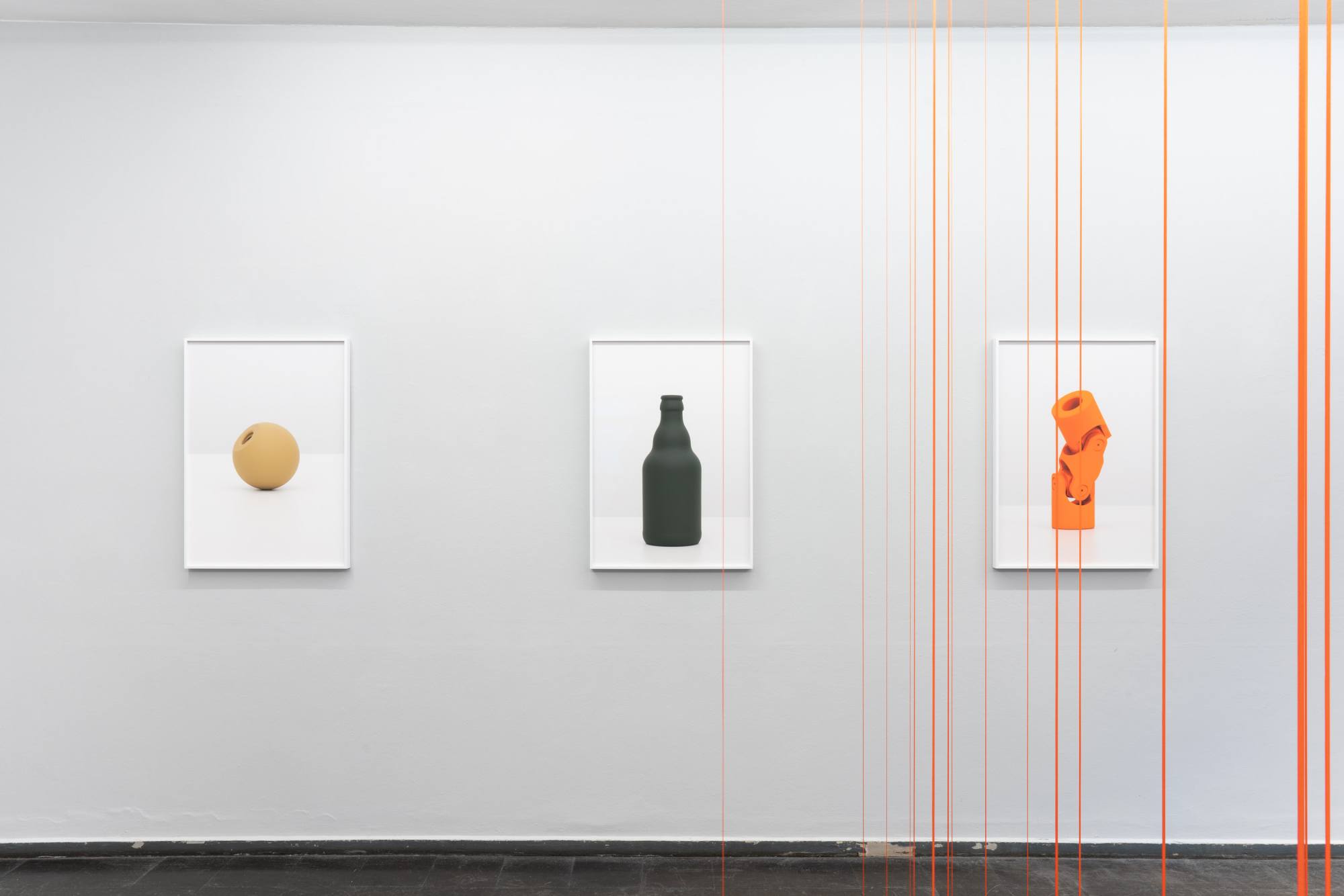
Becker researches the German DIN catalogue of industrial standards and the RAL colour collection that standardize machine parts, materials, and colours since 1917 and 1925, respectively. Seemingly aiming at economic efficiency only, both DIN and RAL did have a great impact on the two World Wars. In times of war, when resources are scarce, standard parts provide advantages in both production and time. Standardized colours, like Dunkelgelb (Dark yellow), introdu- ced in the German armed forces in 1943, and Olive Drab, the camouflage colour of the U.S. Army, shaped the war. During World War II, soldiers disguised in this way were facing each other in the deserts of Northern Africa.
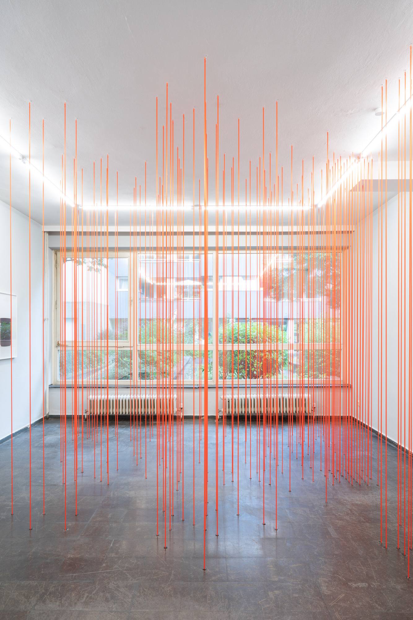
In his series Romankleuren (Novel colours), Besselink processes colours mentioned in novels written and set in Los Angeles. He uses self-created sets of rules as vehicles to make them comprehensible and tangible, physically as well as visually. Thus, his drawings result into a coded network of coloured lines, whose angles change with each chapter. In his paintings Besselink translates the poetics of imaginary colours into quantifiable colour blocks. Finally, orange ribbons, derived from Karen Tei Yamashita‘s novel Tropic of Orange (1997), span the exhibition space and superimpose the architectural system.
Becker and Besselink take history and literature, extract the colours and dissect their symbolic power. By arranging the colours into new forms and media, they offer an immediate visual access to the exhibited works and their inherent systematics. Sensory impressions and contexts, otherwise hardly separate in our perception, can thus be confronted with each other: The upright cardan joint no longer seems just that, after the colour Reinorange (Pure orange) has been identified as the corps colour of the military police Feldjäger, and the standardization of parts as having military purpose. In Besselink’s drawing, the optimistic radiance of golden lines turns brittle as soon as we realize that Ben H. Winters‘ underlying novel Golden State (2018) is about a dystopian surveillance state.
Anika Reineke, Translation: Guus Vreeburg
related links: Carsten Becker | Willem Besselink | Vincenz Sala
